
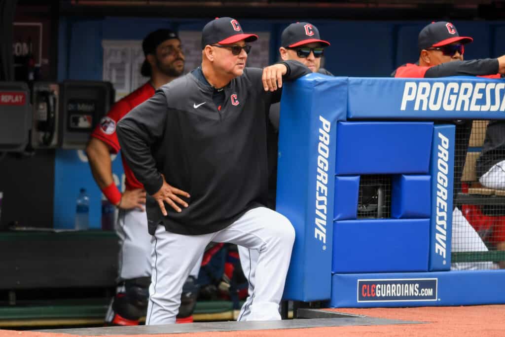
As soon as the 2021 MLB season concludes the Cleveland Indians will be known as the Cleveland Guardians.
Naturally, the social media takes have been spicy hot since the announcement was made Friday morning.
It is tough to just use social media, or sports radio callers, as a thermometer of feelings about the decision.
However, it is clear not everyone is happy with the change.
Some fans, including this writer, are indifferent.
But it is still easy to identify some legitimate gripes fans have on both sides of the argument.
Let’s look at a few complaints that are fair.
3. Not A True Rebrand
Those who truly wanted the Indians name gone were expecting a full makeover by the organization.
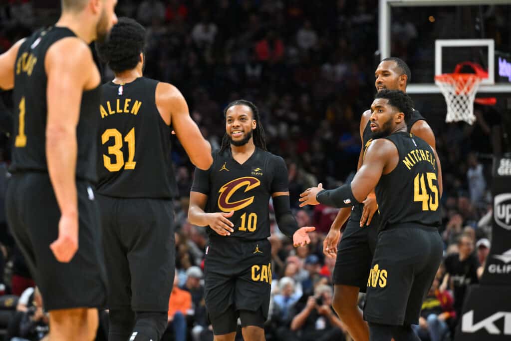
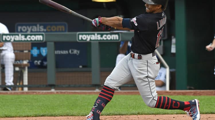
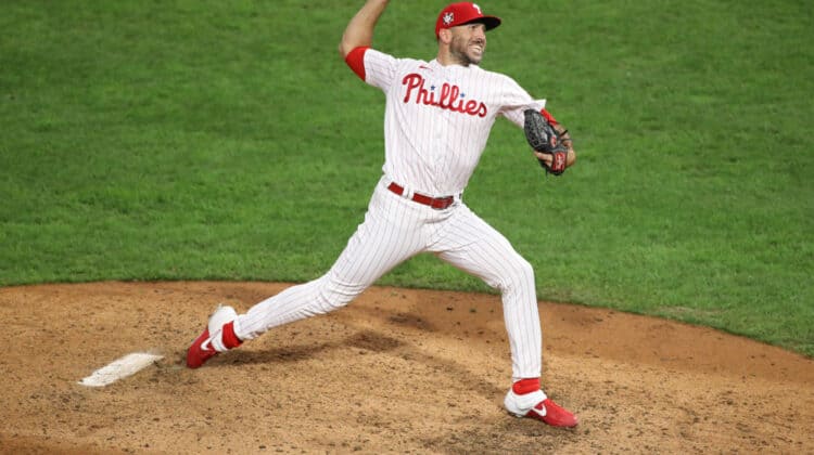
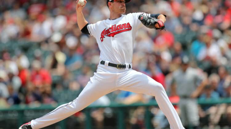
Instead, the colors are staying the same and the only change on the uniforms will be adding “Guar” in front of “dians”.
It is tough to tell the uniforms are new at first glance.
Debuting in 2022. 😍 pic.twitter.com/EJAyGP3fTe
— Cleveland Guardians (@CleGuardians) July 23, 2021
This can be seen as a gripe and as a positive.
While not doing a full rebrand, the team avoided making any drastic changes.
But as we mentioned, a drastic change is what some wanted.
2. The Other Options
There were going to be complaints no matter what name was chosen.
That is true with any decision like this one.
You had fans who clung to the Spiders name, while others liked Blues, or even Grays.
The Municipals was an option as well on a list that was truly endless.
So a vocal contingent of fans being against Guardians makes sense and is legitimate given what can be seen as better choices.
But this gripe is one that was going to exist regardless of the final outcome.
Ultimately, Guardians is a name that is not drawing too much actual controversy and that was likely the goal of ownership all along.
1. The Logo
The organization had plenty of time to come up with a cool logo, and came up with this.
The name Guardians is whatever. But are they serious with this logo? It looks like a stock avatar for Yahoo fantasy football in 2004. pic.twitter.com/0vO90aHeO9
— Brandon Walker (@BFW) July 23, 2021
Now we should point out this is the initial logo and there is plenty of time for upgrades.
It just seems like a better first option could have been unveiled.
The logic is there and draws inspiration from the Guardian bridge sculptures.
But why weren’t the actual sculptures incorporated at all?
They are not seen anywhere in the new logo, so it makes sense why plenty were confused by the connection between the two.
Amateur artists on Twitter are putting out arguably better designs and hopefully the team takes note at the initial reaction.
This is a change for everyone and at least starting with some cool artwork to put on hats and shirts would be nice.


Leave a Reply